IN THE MARGINS
In the margins is a space devoted to some of my side projects and thought pieces. Below are some examples of some project sketches, thought pieces, or collaboration pieces that are directly inspired by my professional work, or that help to inspire that work
FAIL BOX
This little (Arduino) Particle IO project was based on the hypothesis that we tend to remember more negative things than good things, and that tendency might be unfairly coloring our perception. If only there was a way to keep track of good or bad events during the day as they happened, it might be very revealing what state of mind or mood we technically "should" be in as opposed to what mood we "feel" that we are in. The box code itself works on a simple averages equation that continuously builds on itself until the reset button is pressed. Also being a particle IO, it can be used with https://ifttt.com to collect data over time enabling the tracking of good and bad events throughout the week, month or year.
POWER GLOVE VR
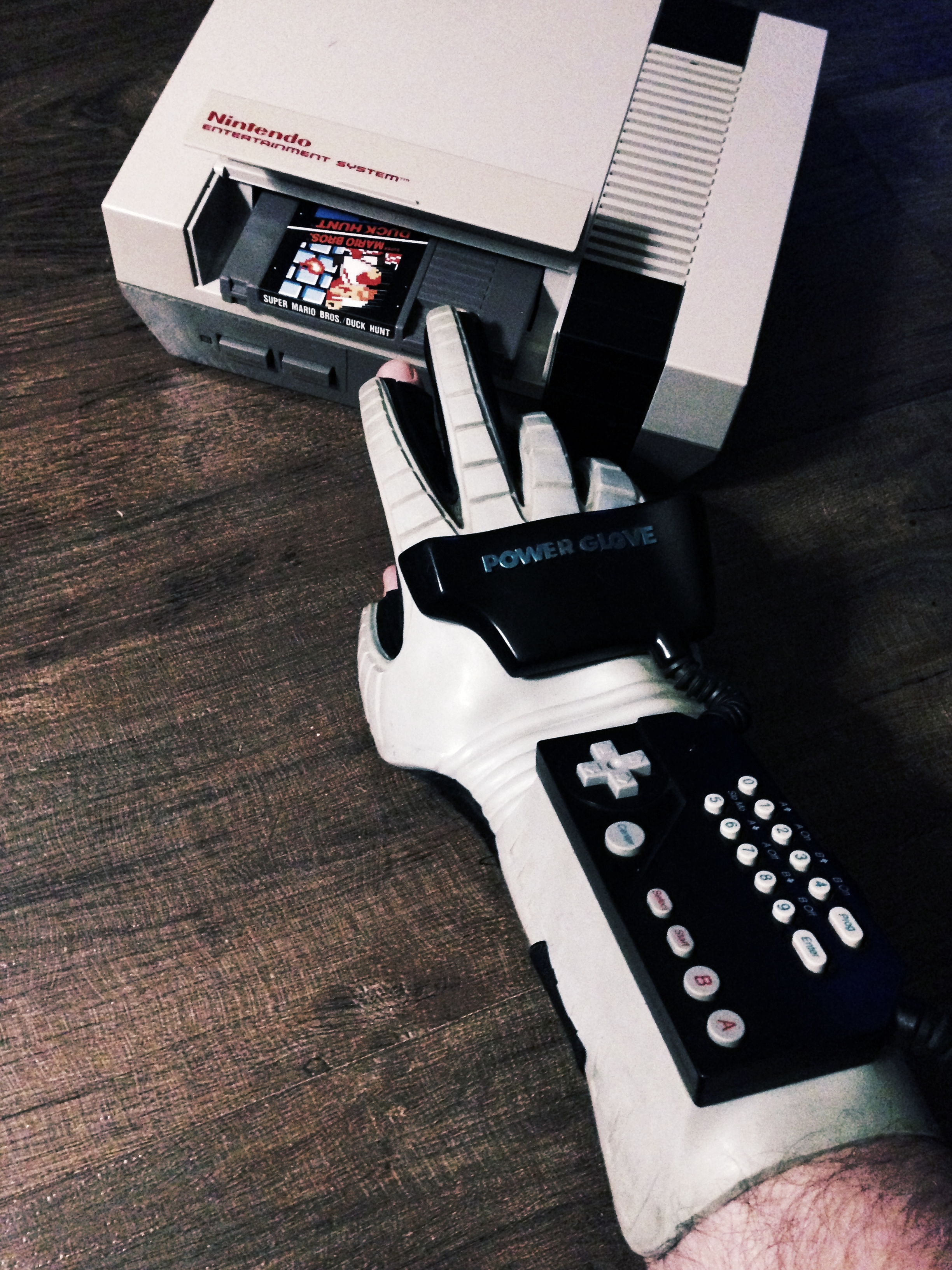
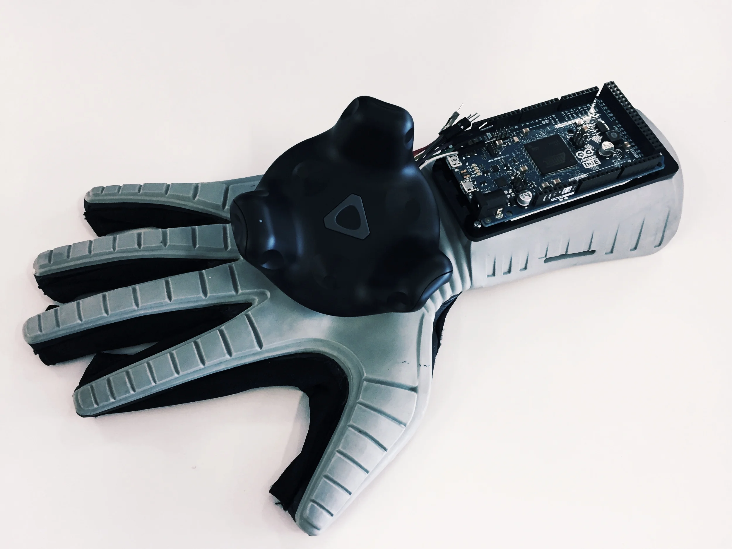
The Power Glove was Nintendo’s first foray into 3D motion-controlled gaming but it was so far ahead of the curve it never had a chance in its era of 2D sprite based gaming. In the current era of AR/VR development, the Power Glove’s true potential is showcased by other, modern VR glove products. However, none of these products have the same 'street-cred' cool factor as the original. Plus one can be had for less than the cost of even buying the flex sensors you would need to buy if you were going to build a VR interaction glove yourself. Initially this project started as a hack project to transfer the guts of a VIVE wand into a Power Glove, but then really got going after VIVE released their Tracker accessory which we found to be perfect for this adventure! Is that kismet?
DUKE REBOOT
When the XBOX started out it was a big unknown. At that time it was very much the underdog to a market that revered Nintendo adored the PlayStation. A few things the XBOX did have in its favor though were true next generation graphics (using true PC hardware), the market changing title 'HALO', and a unique adult sized controller, optimized for the new generation of console gaming. This large controller is affectionately "The Duke".
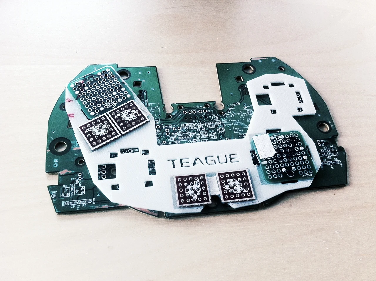
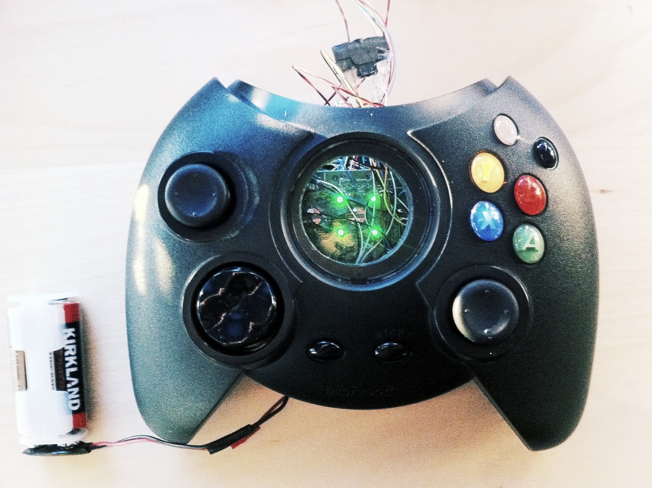
For the 10-year anniversary in November of 2011, Microsoft and Bungie were planning to re-release the original HALO game completed updated for the current ten hardware, the XBOX 360. As a huge fan of the original XBOX, and the 360, I also wanted to do something a little bit special for this 10-year milestone. One of the first things that came to mind was to take an original wired "Duke" controller and turn it into a wireless XBOX 360 wireless controller in time to play the new rerelease of HALO.
This was a fun maker project that ended with a fully functional Duke controller that I could and did use to play the HALO re-release title. This project taught me a lot about prototyping methodology, but the biggest learning came from the actual use of the controller. The 'Duke' in practice wasn't as good as I remembered it to be, and the reverence I had for this original controller was quickly put in its place by the shortcomings the original design (size and button placement as primary culprits). It was still fun to play though HALO with it again, but the modern XBOX controller is just a better solution.
Duke Reboot on TEAGUE LABS
PRINTABLE SPACE PEN
The story goes somethings like this: Back during the great moon race of 60's, NASA spent millions of dollars developing an 'astronaut pen' that would work in outer space, while the Soviets solved the same problem by simply using a pencil. As colorful and believable as this tale is, especially since there is a remarkable pen that can work in the extremes of outer space (the Fisher Space pen), it turns out it’s not true.
Regardless of the validity of this tale, I still love this anecdote. It’s a modern recounting of the philosophical principal of Occam's razor, which states, the simplest path is usually the correct path. As a designer, I often find that complex problems can mask simple solutions. When I find myself with a design that seems overly complicated, this NASA fable helps to remind me that I should be taking a step back to find a simpler solution. This pen was created as a nod to this this NASA story and a reminder that simple solutions tend to be the best solutions.
Aside from being a practical pen designed to work with Moleskine journal books, its also represents two disparate products that represent this modern fable. The Fisher Space pen cartridge represents a no-compromise technology solution that will perform well beyond what will be required of it in practical use. This cartridge is only achievable with specialized precision industrial manufacturing methods and only attainable through retail channels. The pen body represents the simple solution. Its an easy to produce low tech product optimized for its use and for its manufacturing method. Its quick and cheap to produce as needed but is only available through the process of 3D printing.
PAINTERS TURNTABLE
As a designer and a maker, I sometimes find that the tools I need to produce the things I wish to make don't exist. Such is the case with this quick maker project.
I had a set of prototype appearance models that I needed to make that all needed to appear like molded cardboard (similar to an egg carton). Because of the complexity of the forms and the turnaround time required, the base models were 3D printed. I was able to recreate the color and feel of this cardboard texture by building up several layers spray paint spatter across a form. However since the color and texture was a result of how the paint was layered, it became very difficult to consistency across all the pieces just trying to accomplish the by hand.
Using a spare Arduino, a constant rotation servo motor, and a few scraps of laser cut acrylic, I was able to quickly make a speed adjustable auto turntable that let me lay down an identical color and texture pattern across all the parts. Originally intended for this one purpose, I and others found it to be supremely useful in many subsequent paint projects that required a bit more control and consistency.
FAST COMPANY CONSOLE REVIEWS
As a gamer I was quite excited by the announcement of the current console generation to be launched back in November of 2013. A lot of buzz had been created for both the PS4 and the XBOX One, and I was excited to experience what Sony and Microsoft had come up with that would be representing the next half decade or more of gaming in the living room. I also saw an opportunity to do a different kind of review here than what typically and had previously been done with game consoles. Instead of doing a review from the tech/performance side, which most everyone had been focused on, I thought it might be refreshing to do a review from design side. Putting these consoles in the hands of professional designers to get their candid and honest opinion from a product design standpoint.
Fast Company also thought this was neat idea and partnering with the studio designers/gamers, pretty soon we were all set to review both consoles over the two weeks they were released. Our scope for these reviews included the initial out of box experience, the user experience of setting up the consoles and getting to the point of gaming, and then the fun part of actually playing games across both to get a sense of the hardware in use. We hosted a diverse group of TEAGUE designers from product, to graphic, to UX design to gather impressions, likes and dislikes, and over those two weekends summarized our thoughts and reactions.
To see our specific thoughts on how those consoles stacked up, head on over to Fast Company here:


![photo[2].JPG](https://images.squarespace-cdn.com/content/v1/5ace44e19d5abb8e9b8a2eea/1524512400352-BFVJ98KEGM9HHISIH3BS/photo%5B2%5D.JPG)

